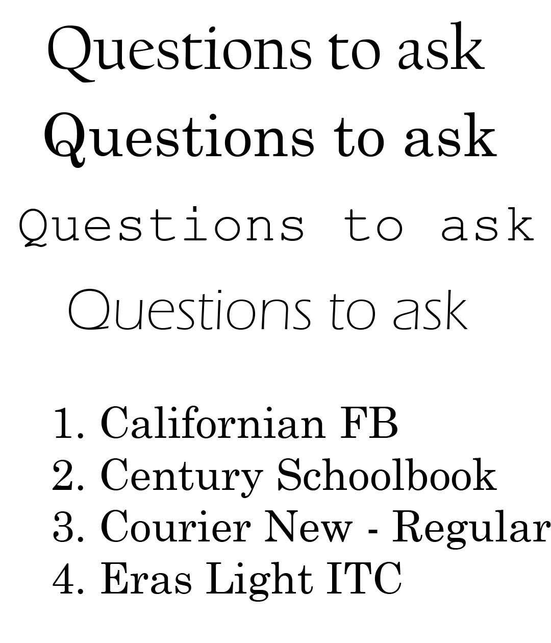
I want the font displayed in my info graphic to be quite plain and easy to read, I think it should be deemed extremely important information to a certain audience so I want to choose a text that reflects a certain clean style.
My personal favorite is the 4th one 'Eras Light ITC', I think its quite stylish and could work well for my project. The other three are other contenders but I think unless someone advises otherwise, the 4th one is a good choice for me.

No comments:
Post a Comment